Trata Rebranding
A household brand
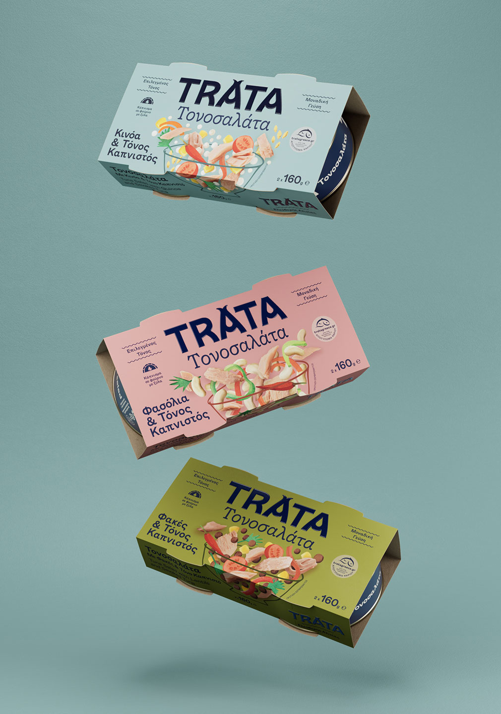
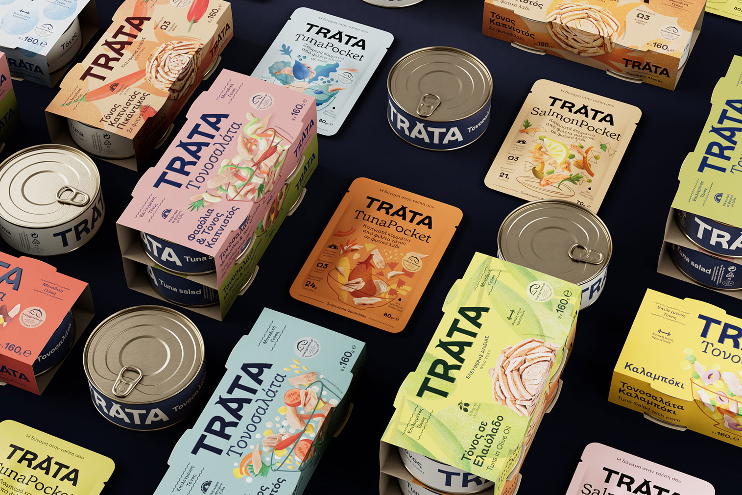
Trata Greece has produced quality seafood for three generations. We undertook a significant brand transformation following an in-depth process that spanned over a year and a half, from the creative strategy, brand architecture and extensive workshops to ideation and crafting of the new logotype, the designing of seven series of packaging, trade booths, and an exclusive brand font using bespoke glyphs.
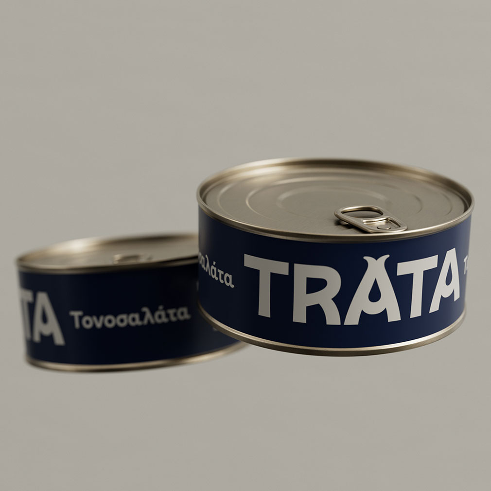
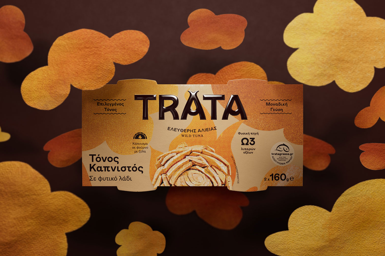
The playful logo transforms an A into a fish tail containing a drop of seawater or olive oil — an organic representation of the brand’s main ingredients. The wavy, rounded typography is inspired by the movement of the sea.
Lively colours and upbeat illustrations convey a world of vibrant flavours. Hand-drawn serving suggestions emphasise a healthy diet and the joy of home cooking, encouraging consumers to experiment with new flavours. Each product is defined by bold shapes, textures, and colours that complement one another.
A dynamic identity designed to reflect the brand values — confidence, quality, sustainability, and innovation — and appeal to health-conscious consumers open to trying new things.