Athens State Orchestra
Campaign 2011–2012
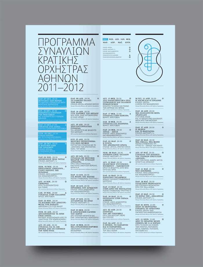
The Athens State Orchestra is the principal symphony orchestra in Greece, established more than 100 years ago. We were asked to redesign the previous logo, which was a vague representation of a fragment from an ancient Greek amphora. The brief was to update the look and feel with a more European perspective, but also to communicate the orchestra’s Greek origins. The solution was to create a symbol that depicts the three ‘families’ of a typical orchestra: the strings, brass and percussion instruments, illustrated in a way that communicates simplicity and harmony. The symbol’s three distinct elements outline a Cycladic idol, an ancient amphora, and an Ionic column. We used Fontsmith’s Albert font, a friendly sans serif font that is shapely, flexible and modern.